The New School
Visual and Cultural Studies
Course Introduction: What is Visual Studies?
Our topic in this course is visual culture. What is it? How is it created? What does it include? How does one go about studying visual culture? What methods are used? What is the objective? What can we hope to get out of it? Why does it matter?
As I said in the course description at the top of your syllabus, our everyday experience is characterized by a constant flow of images. Everywhere we look, whether we're walking down the street, driving on the highway, looking at a magazine, reading the newspaper, waiting for the subway, or picking up our messages on a cell phone, we're reading, interpreting, and negotiating our way through a sea of visual images.
Let's
begin with an obvious and mundane example. This is an image of the desktop
window
of my laptop computer on Monday morning, January 19, 2004.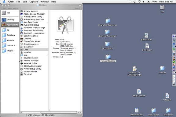 [Illus.
1: Mac OS X Desktop.] My computer is a tool for organizing and storing
information, for writing, and for
communicating with others. I don't know a lot about the inner workings
of the computer and, generally speaking, I'm not particularly interested
in how it works. My primary concern is that it functions properly and keeps
working as efficiently as possible. But, like most people, I know by osmosis
that underneath the hood of my computer is an electronic, mathematical
calculating machine. Apparently, all of the operations performed by my
computer are based on a combination of very fast calculations carried out
on nothing more than microelectronic switches that are either on or off
and that can be thought of as a series of zeros and ones. In other words,
what I see on the screen, and how I think about my sleek, stylish little
Mac, bears almost no relationship whatsoever to the "reality" underneath
the hood. What I see on the screen looks nothing at all like zeros and
ones. I see words and pictures. I have a certain affection for the icons
and symbols that show me how I can change the color of the text, insert
characters, add footnotes, check my spelling, save my document so that
I don't lose everything I've done in the last hour, and file it away with
all of the other relevant material that I use for my course on visual studies.
[Illus.
1: Mac OS X Desktop.] My computer is a tool for organizing and storing
information, for writing, and for
communicating with others. I don't know a lot about the inner workings
of the computer and, generally speaking, I'm not particularly interested
in how it works. My primary concern is that it functions properly and keeps
working as efficiently as possible. But, like most people, I know by osmosis
that underneath the hood of my computer is an electronic, mathematical
calculating machine. Apparently, all of the operations performed by my
computer are based on a combination of very fast calculations carried out
on nothing more than microelectronic switches that are either on or off
and that can be thought of as a series of zeros and ones. In other words,
what I see on the screen, and how I think about my sleek, stylish little
Mac, bears almost no relationship whatsoever to the "reality" underneath
the hood. What I see on the screen looks nothing at all like zeros and
ones. I see words and pictures. I have a certain affection for the icons
and symbols that show me how I can change the color of the text, insert
characters, add footnotes, check my spelling, save my document so that
I don't lose everything I've done in the last hour, and file it away with
all of the other relevant material that I use for my course on visual studies.
So one observation we can make on the basis of this brief reflection is the philosophical claim that things are not always what they appear to be. In one sense, we could say that there is a reality at the electronic level -- the binary, mathematical, and algorithmic operations which form the basis of computer programming. And there is also the appearance on the screen -- the results of the mathematical manipulations of zeros and ones which (fortunately for me) don't look anything like that. The appearances are deceptive, but comforting and useful. And that's what matters to me. I want to feel comfortable in my working environment and want to find my way around without having to think about it. I want my tools, for the most part, to be "transparent" -- I don't want to see them. I simply want them to work effectively without drawing undo attention to themselves. I have other, more interesting things to think about.
But, of course, it's not really as simple as that. I work on a Mac because I've always preferred the way it looks to that of an IBM or Windows operating system. That was more important twenty years ago when the differences were significant and obvious. Today, what you see on the screen looks pretty much the same on any PC. But the reason they do is because of the "graphical interface" -- the presentation of information and tools through a carefully constructed and designed set of images.
Consider what's there. We see, scattered across the surface, an array of small pictures that look like blue file folders with words underneath them. In the top right hand corner, we see an image of what appears to be a mechanical device with the letters "HD" below it. There are also a number of other rectangular objects with symbols and letters on them, and words underneath. On the far right side, in the middle of the screen, is a long narrow rectangle with a series of images lined up one above the other. At the top, we have another series of long, horizontal bands with words, numbers, and icons. And finally, on the left, there is another group of vertical rectangles within a rather large rectangle, all of which are filled with a fairly complicated combination of words, icons, shapes, and colors.
Context, Background Knowledge, and Meaning
So far, what I've given you is a boring, descriptive sketch of what one sees when looking at the image on the screen. I've tried not to interpret what we see there or say what the symbols, words, and icons mean, but to give a rough, simple, straightforward account or inventory of the contents of the screen image. Most of you can probably identify these objects for yourselves. They may be familiar, easily recognizable images that you're accustomed to seeing everyday. But, because they are the kinds of images that we don't generally want to think about, we don't really look that carefully at them -- we don't give them a second thought -- unless, of course, we see one that we can't identify. At that point, our transparent system and comfort level breaks down and we're confronted with a strange, alien thing. Only then does the look of the thing stand out and raise an issue for us.
Another occasion for looking carefully -- analytically -- and critically is the current one, when we're engaged in a study of visual images -- what they are and how they work. It's at times such as these that we step back and look at what we're doing from a different perspective. We objectify and examine both the structure of the visual world and our experience of it. And in doing so we make the familiar strange. This estrangement helps us reflect on the everyday; it turns transparent objects opaque so that we can see them more effectively before returning them to their ordinary function as tools to be used without much thought or reflection.
I
won't prolong the agony of investigating the image of my desktop much
longer, but I do
think it's worthwhile to spend another few minutes noticing some aspects
of this screen space that we may be inclined to take for granted. I use
the term "screen space" because it's analogous to what artists
and art historians refer to as "pictorial space". [Illus. 2:
Emanuel de Witte, Interior with a Woman at the Virginals, c. 1665.]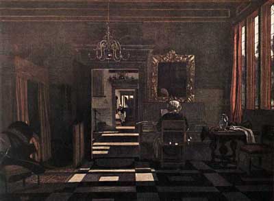 Pictorial
space is the implied space of a picture - the space that your eye moves
through as you gaze upon the image and look at the relations among the
objects represented in the picture. Some of those objects may overlap,
some may be far behind and smaller than those in the foreground, some may
be less distinct than others. In each case, the effect may give the illusion of
real space between the objects, with some closer to the viewer than others,
as in the painting
by de Witte. Screen space often makes use of the same conventions. [See
Illus. 1 above.] Notice that the Mac designers have given cast shadows
to the text and many
of the objects represented, creating the illusion that they are substantial,
three-dimensional objects slightly removed from the surface of the desktop.
Note also the simulated "lighting" used on the file folders,
with a strong highlight in the top left corner, fading to dark as you move
from upper left to lower right. This suggests a light source just above
the objects and to their left. Similar lighting is used to highlight the
volumetric structure of the hard drive icon -- the little machine-like
image near the top right corner of the screen.
Pictorial
space is the implied space of a picture - the space that your eye moves
through as you gaze upon the image and look at the relations among the
objects represented in the picture. Some of those objects may overlap,
some may be far behind and smaller than those in the foreground, some may
be less distinct than others. In each case, the effect may give the illusion of
real space between the objects, with some closer to the viewer than others,
as in the painting
by de Witte. Screen space often makes use of the same conventions. [See
Illus. 1 above.] Notice that the Mac designers have given cast shadows
to the text and many
of the objects represented, creating the illusion that they are substantial,
three-dimensional objects slightly removed from the surface of the desktop.
Note also the simulated "lighting" used on the file folders,
with a strong highlight in the top left corner, fading to dark as you move
from upper left to lower right. This suggests a light source just above
the objects and to their left. Similar lighting is used to highlight the
volumetric structure of the hard drive icon -- the little machine-like
image near the top right corner of the screen.
We'll talk more about the conventions that are at play here when we cover visual analysis next week and semiotics later this semester. But for now just note that some of the objects on the screen are intended to look like things we associate with writing, filing, storing, etc., namely, sheets of paper, file folders, and file drawers, not like the things to which they are actually indexed or physically connected, i.e. the particular (electronic) location in the computer's memory where the items "placed" in the folder are stored. The image of the file folder doesn't look anything like the actual storage location in the computer, nor does it simply state the address -- a series of characters -- identifying the location of all objects in the directory. Rather, it looks like the sort of thing one would use to file actual sheets of paper.
Or, consider the image of the scissors just to the left of center. This refers to the process of cutting and stands for the Apple software program -- "Grab" -- used to capture and save the image of the current screen on my laptop. The image is quite specific. It not only suggests the "cutting" involved in capturing an image, but behind the scissors you can see an image of a tilted Mac OS X screen, a hint that this application is for grabbing screen images, not for cutting text from documents. I should add that this rather sophisticated representation works only if the viewer brings along a certain background knowledge about the appearance of Mac OS X windows. Those three little buttons at the top left of the screen image are the telltale sign of OS X. But since the user of the Grab application is already working in a Mac OS X environment, they already know how OS X windows look. So the image functions "transparently" -- you don't give it a second thought -- it suggests what you need to know without drawing attention to itself. When the intent is to be helpful, there's no problem with such subtle and unobtrusive influences. Problems arise when the intent is coercive or manipulative. We'll talk more about that later.
Now let's move
from the prosaic surface of the computer screen to a more provocative space
in the cinematic world of David Lynch. [Illus. 3: Laura Harring ("Rita", "Camilla
Rhodes"), Film Still from Mulholland Drive, 2001, David Lynch.]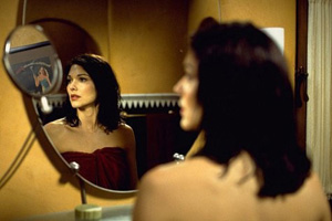 The
image of the woman looking into a set of mirrors is taken from Mulholland
Drive. The
movie begins with a violent car accident in the Hollywood hills in which
a car
of young
people collides with a limousine. There is only one survivor -- Camilla
Rhodes -- the dark-haired woman in this shot, who suffers from amnesia
as a result of the head injury suffered in the accident. Camilla has wandered
into a house which is subsequently left vacant by an actress who leaves
town for a shoot in Canada. The woman's niece, a perky ingénue from
Canada named Betty Elms [Illus. 4: Naomi Watts ("Betty"), Film
Still from Mulholland Drive, David Lynch, 2001.],
The
image of the woman looking into a set of mirrors is taken from Mulholland
Drive. The
movie begins with a violent car accident in the Hollywood hills in which
a car
of young
people collides with a limousine. There is only one survivor -- Camilla
Rhodes -- the dark-haired woman in this shot, who suffers from amnesia
as a result of the head injury suffered in the accident. Camilla has wandered
into a house which is subsequently left vacant by an actress who leaves
town for a shoot in Canada. The woman's niece, a perky ingénue from
Canada named Betty Elms [Illus. 4: Naomi Watts ("Betty"), Film
Still from Mulholland Drive, David Lynch, 2001.], has
arranged to stay in her aunt's house while
she's away. Betty arrives to find Camilla in the shower. Embarrassed and
surprised, she apologizes for interrupting her and asks her name. Camilla
hesitates -- clearly unable to recall who she is. Before she can reply,
Betty leaves Camilla in the bathroom to finish her shower and goes back
to her aunt's bedroom to unpack her bags.
has
arranged to stay in her aunt's house while
she's away. Betty arrives to find Camilla in the shower. Embarrassed and
surprised, she apologizes for interrupting her and asks her name. Camilla
hesitates -- clearly unable to recall who she is. Before she can reply,
Betty leaves Camilla in the bathroom to finish her shower and goes back
to her aunt's bedroom to unpack her bags.
The film cuts
to a movie poster on the wall of the bathroom. [Illus. 5: Rita Hayworth
, Publicity Poster for Gilda, 1946, Charles Vidor.] It's an image of Rita
Hayworth from the 1946 film noir classic Gilda.
The words "There
NEVER was a woman like Gilda!" form an arc over the image of the glamorous
femme fatale posed languidly in a strapless blue gown, a cigarette in her
left hand. The camera lingers on the image of the poster, then cuts to
Camilla sitting in front of the mirror, still contemplating her lost identity.
[See Illus. 3 above.] In this shot, we see Camilla in the foreground,
out of focus and her image in the mirror in sharp focus. Her face softly
lit
from
the
bridge
of her nose to her chest. There's a second mirror in the top left corner
of the screen into which Camilla gazes. In the small mirror she sees the
poster on the far wall. The camera zooms in, the image dissolves and fades
to Camilla entering the bedroom where Betty is still unpacking. Camilla,
drying her hair with a towel, looks at Betty and says, "My name's
Rita." 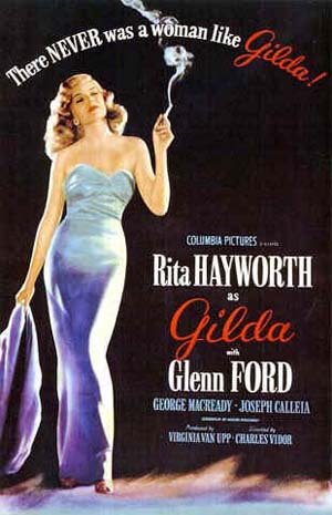
This image of Camilla's gaze occurs at a key moment in the narrative when the relationship between Betty and Camilla is being established. They will soon become lovers. But for now, Betty is hoping to establish a "new identity" in Hollywood as an actress and is thoroughly nonplussed and delighted to be in the city of dreams. Camilla, on the other hand, has no idea who she is. Nor do we. Her true identity is the mystery that drives the narrative. It's significant that her provisional name emerges from a mirror image of a poster of a Hollywood star. It's through a childlike and innocent gaze into a mirror, through multiple layers of image and representation, that she comes to misrepresent herself. Is it that any identity will do? Is there some significance to the name "Rita"? Why not "Gilda"?
These are questions that cannot be answered by the image upon which we gaze. The image created for us by David Lynch sits there, suggestive, seductive, but ultimately ambiguous. There are many possible meanings and interpretations. But how are they determined? In the context of the rest of the film? By reference to other films, stories, personal experiences, photographs, paintings, or advertisements? Can we count on the filmmaker to provide narrative closure and resolve the ambiguities? Or does the ambiguity itself serve another function?
It's instructive
to compare the film still from Mulholland Drive (actually a publicity
photograph taken from the film narrative) with another "film still" from
the artist Cindy Sherman. [Illus. 6: Cindy Sherman, Untitled Film Still
#35, 1979.]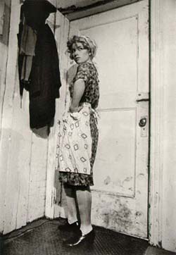 If
you're familiar with her work, you know that she emerged in the late '70s
in New York as an artist who
used
photography
to create images of women in a variety of settings -- a large body of work
referred to as "Untitled Film Stills". They were not literally
taken from films, but suggested that they were through the careful construction
of iconography, pose, situation, and lighting. There is also a kind of
implied narrative to each of the photographs. The figure -- the artist
herself in costume and makeup -- often seems to be caught by surprise or
depicted in a private moment of self-absorption. But they differ from the
image of Camilla in that there is nothing that precedes or follows the
moment depicted in the image. Each image is a detached signifier with no
narrative history of its own. That does not mean there are no references.
The fact that they are untitled "film stills" points to the history
of filmmaking and the representation of women in western popular culture.
It is in that context that one must look for the sources, precedents, and
social practices that give these images their meanings.
If
you're familiar with her work, you know that she emerged in the late '70s
in New York as an artist who
used
photography
to create images of women in a variety of settings -- a large body of work
referred to as "Untitled Film Stills". They were not literally
taken from films, but suggested that they were through the careful construction
of iconography, pose, situation, and lighting. There is also a kind of
implied narrative to each of the photographs. The figure -- the artist
herself in costume and makeup -- often seems to be caught by surprise or
depicted in a private moment of self-absorption. But they differ from the
image of Camilla in that there is nothing that precedes or follows the
moment depicted in the image. Each image is a detached signifier with no
narrative history of its own. That does not mean there are no references.
The fact that they are untitled "film stills" points to the history
of filmmaking and the representation of women in western popular culture.
It is in that context that one must look for the sources, precedents, and
social practices that give these images their meanings.
We'll return to the problem of the ambiguity of visual images in the next section. The point I want to make now should be clear from what I've said above, namely that images in themselves may be interesting, intriguing, baffling, seductive, disturbing, or beautiful, but to think and talk about them we need tools -- words and concepts. To interpret them we need something like a theory. And to understand what they do and how they affect our thoughts, perceptions, desires, feelings, and behavior, we need to combine the use of concepts and theories with observation and careful reasoning. This course is an introduction to that process.